“This 3D interactive website marks the first time in Thailand that national election results are presented in such an engaging manner.”
Timeline
Feb – May 2023 (3 months)
CLient
Nation Group (Thailand) Public Company Limited
Employer
Boonmee Lab
Tools
Figma
Background
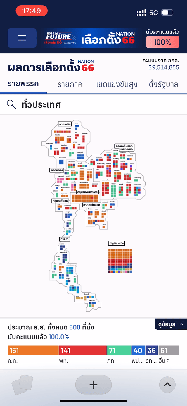
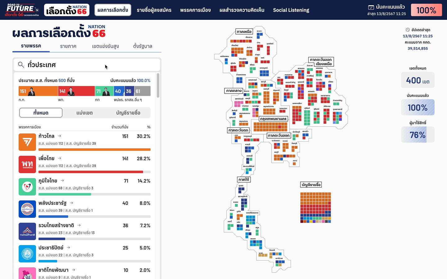
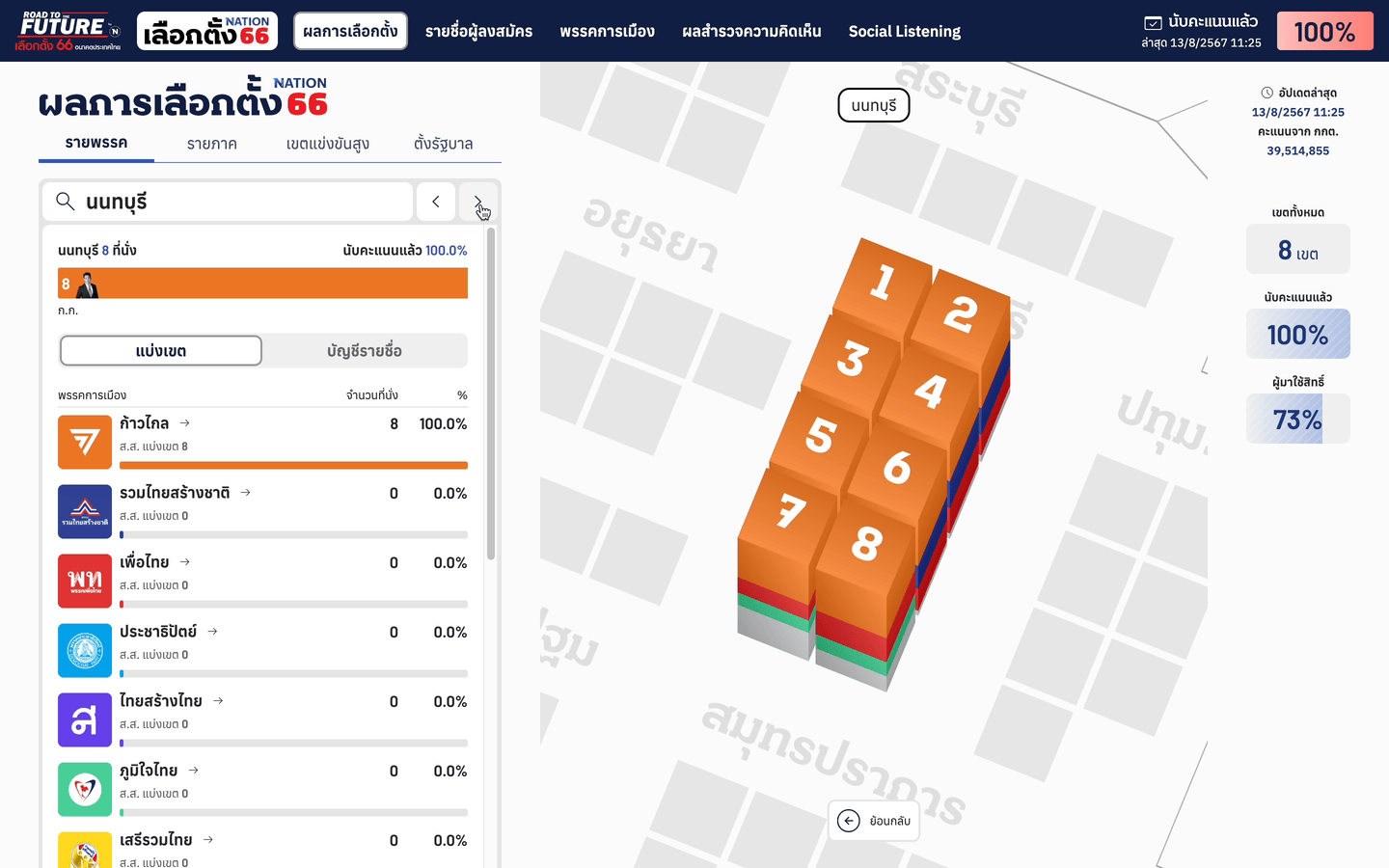
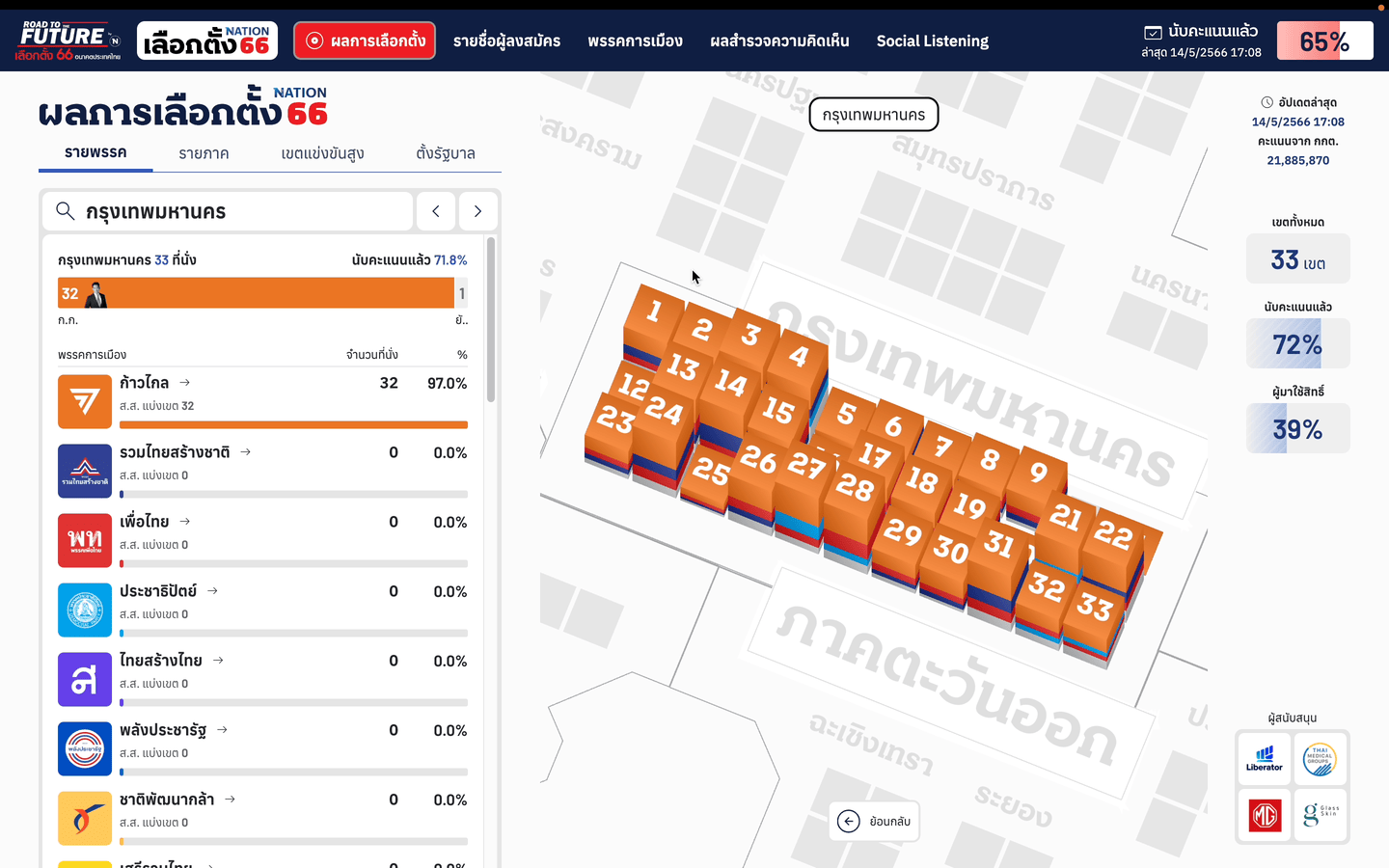
The 2023 Thai general election on May 14 marked a crucial period for Thai democracy after nine years of military rule, with over 75% voter turnout, reflecting strong enthusiasm for change. The Nation’s general election 2023 website provides comprehensive information on the election, including live results, poll data, public opinions from social listening tools, related news, and the Thai election database, such as political parties and candidate profiles. The website utilizes a user-friendly interface featuring visualizations and infographics, ensuring accessibility for all. It places a strong emphasis on presenting information through innovative methods and media, aiming to provide a range of diverse perspectives.
my role
UX/UI Designer
Designed user experiences and delivered high-fidelity prototypes.

Leveraged a variety of data visualization techniques to to transform raw data into meaningful insights. Designed dynamic charts, graphs, and heat maps combined with intuitive user interfaces that allowed users to interact with data, revealing trends and patterns that help present data insights.

Conducted A/B testing, and usability evaluations to identify areas of improvement.

Delivered presentations and design proposals, ensuring clear communication of design rationale and project progress.
Challenge
The National Election in 2023 received a lot of public attention and was expected to be a game-changer for the country. The client, NationTV, wanted an outstanding data visualization to display live election results. The website also needed to function during live television broadcasts, where we can expect audiences of various ages. Therefore, the design had to be engaging yet easy for users to navigate and capture information.
In addition, my team and I delivered this project all in the time frame of two and a half months; designing and developing data visualizations, preparing graphic assets for political parties and candidates database, and weekly launching a page contents on the later half of the timeline. This project is probably one with the most tightest schedule and most challenging project our team ever got our hands on.
Value delivered
I played a pivotal role in conceptualizing and executing the user experience and data visualization design for this election website. My efforts ensured that complex election data was not only accessible but also engaging and easy to navigate between presentation views. UX design and prototypes were improved based on user feedback from many iterations until we reached the final design. It was always challenging for me to come up with new visualization techniques, especially for work that would be seen by millions at different ages. The 3D interactive chart I introduced was the first of its kind in Thailand to present the political data in this engaging manner, evidenced by numerous positive feedbacks received on the election day. This was an invaluable experience in my design career and a memorable one in helping to significantly enhance public participation and transparency during a crucial time for Thai democracy.
Research
To ensure the success of the Thailand Election Website 2023 project, we employed a comprehensive research methodology that included several steps. First, we conducted a competitive analysis by analyzing similar election websites from other countries to identify best practices and interesting visualization techniques that could be adapted for the project.
Next, we carried out multiple rounds of usability testing with interactive prototypes. Participants were asked to complete specific tasks, and their interactions were observed and recorded to identify pain points and areas for improvement. Based on the feedbacks, we iteratively refined the design and functionality of the website, ensuring it met the high standards of usability and accessibility required for a national election platform.
Final Design
We have undertaken a remarkable reimagining across various presentations, introducing novel and intriguing elements through these three aspects:
Election map experience
The live election map results are divided into different views, including party scores. Users can seamlessly explore live updates from the 2D country and regional levels to detailed 3D constituency-level data. This 3D interactive website marks the first time in Thailand that national election results are presented in such an engaging manner.
description of the gif
Map navigation
Users can seamlessly navigate through different levels of detail by clicking on specific areas of the interactive map. As they explore, they are treated to a stunning experience, with smooth 3D animations guiding them through each transition. The effect provides a clear and intuitive way to drill down into layers of election data. For easy navigation back to the previous area, I designed a back button at the bottom of the map.
description of the gif
Search navigation
Users can search for and navigate to specific areas to view election results. The system will automatically provide suggested results that match with the input keywords. This function works across all geographical levels, from the country-wide view down to individual constituencies, allowing for quick and efficient navigation to desired locations.
description of the gif
Arrow navigation
Users can navigate between different areas at the same level using arrow buttons in the main control panel. This feature allows for quick comparisons of election results across areas under the same geographical level.
View by party
We used a stacked bar chart to show the distributed percentages of leading parties, while bar charts below display the number of seats in the parliament each party received.
Provincial level
Filter by party
View by region
Users can view the election outcome data from 7 geographical regions, allowing for a comparative analysis of party vote proportions across each region, including Bangkok, Northern, North-Eastern, Central, Eastern, Western, and Southern regions. We selected a proportional area chart (Circle) for the main visualization to provide a quick overview of distributions among each party.
View by a coalition of parties to form the government
Offering insights into potential coalition government formations and the prime ministerial vote, this view allows users to explore different formulas of the government based on Thai laws. If a coalition of parties secures more than half of the parliamentary seats, they are permitted to form the government. If they obtain at least 376 seats, they have the authority to appoint the prime minister.
Visualization during live voting results
Explore different formations
Live broadcasting presentation
The design is compatible to a range of screen sizes. From expansive desktop displays to compact mobile screens, and even specialized reporter interfaces, the website's responsive layout ensures optimal viewing across all platforms. This adaptability extends its utility beyond mere online browsing, transforming it into an invaluable resource for television reporters during live broadcasts.
To further enhance this flexibility, we've implemented a sophisticated control panel that puts the power of content management directly into the hands of show producers. This intuitive interface allows for real-time adjustments and seamless oversight of on-screen content throughout television broadcasts. The control panel's user-friendly design enables producers to effortlessly navigate between different data visualizations, update information on the fly, and maintain a smooth, professional broadcast experience.
Live visualization
During live broadcasts, we display 3D bar charts with varying heights to represent the percentage of votes counted at the provincial level. Taller bars indicate more progress in vote counting.
description of the gif
Live transparent UI
When users zoom into the constituency level, we use a transparent placeholder to show the percentage of votes yet to be counted.
Integrated election data
Prior to the elections, the website has presented a comprehensive candidates database. This database features not only historical election records but also in-depth analyses from seasoned reporters. Additionally, it includes interactive polls that have been conducted in two thorough rounds, offering users a detailed and engaging way to understand the electoral process and the candidates involved.
Election Polls
Polls, which included various surveys and statistical analyses, and social listening data, which encompassed the monitoring of social media platforms and online discussions, were published extensively before the election day. These data sources aimed to provide insights into public opinion, voter intentions, and the general sentiment of the electorate leading up to the crucial event.
The political party that the public wants to vote for.
Forecasting 500 seats for MPs, divided between constituency and party-list.
Polls: the person whom the public wants to elect as the Prime Minister.
Social listening: 5 most talked about political parties on popular social media
Party profile
Users can navigate through comprehensive profiles of various political parties. Important information, such as the prime ministerial candidates, is prominently displayed, alongside the list of candidates running for the House of Representatives.
Candidate profile
For candidate profiles, users can explore general information such as age, educational background, records from previous elections, relevant news, and importantly, see other candidates in the same constituency.