Making telehealth services become more accessible.
MorDee
META DATA
Timeline
Mar – DEC 2021
(9 months)
(9 months)
type
Mobile application
CLient
True Digital Group Co., Ltd.
Employer
Boonmee Lab
Tools
Figma
Figjam
Figjam
Process
User research
UX/UI Design
Usability test
Design system
Branding
UX/UI Design
Usability test
Design system
Branding
Link
Background
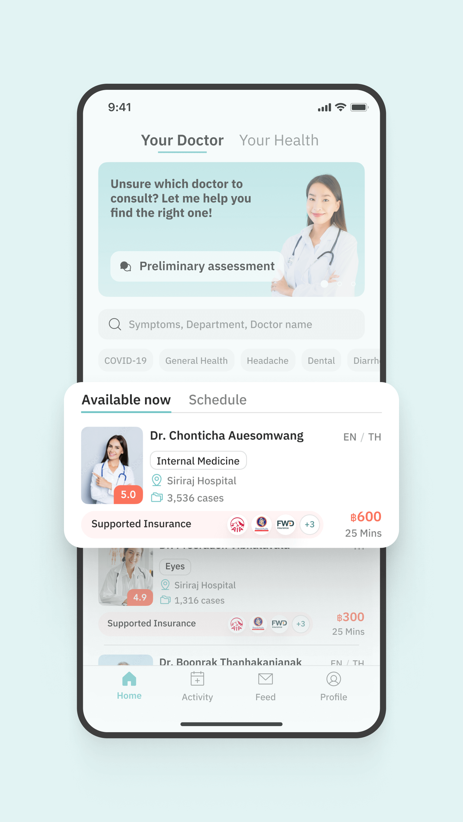
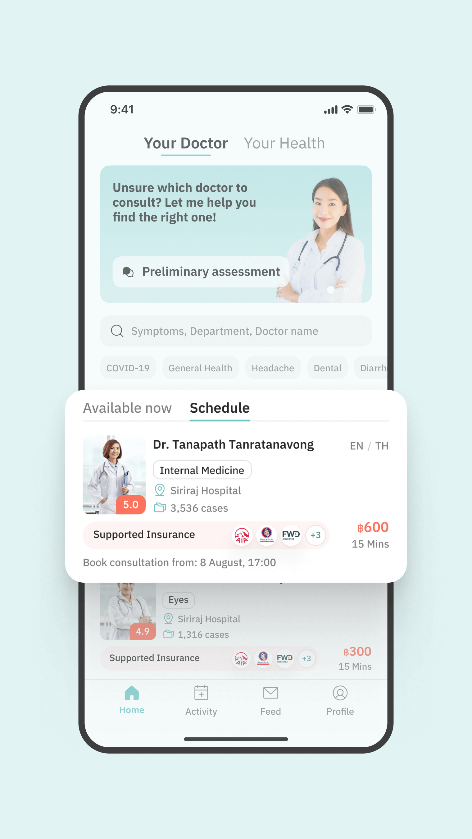
MorDee is a telehealth service that aims to provide all-in-one healthcare services for Thai patients through a mobile application. Its key features include video call consultations, personal health data management, and an online pharmacy. These services proved especially valuable during the COVID-19 pandemic, when health services became more available and accessible to the general public through online channels.
In 2021, Boonmee Lab was tasked by the client to redesign the application to align better with their current plans. As a lead designer, I worked closely with the client to enhance the user experience in three key areas: appointment booking, privilege discount application, and booking confirmation. The project involved user interviews, designing new user flows, creating high-fidelity user interfaces, and delivering the design handoffs for developers to implement the new design.
In 2021, Boonmee Lab was tasked by the client to redesign the application to align better with their current plans. As a lead designer, I worked closely with the client to enhance the user experience in three key areas: appointment booking, privilege discount application, and booking confirmation. The project involved user interviews, designing new user flows, creating high-fidelity user interfaces, and delivering the design handoffs for developers to implement the new design.
Challenge
During the COVID-19 pandemic, many health services shifted to online platforms to maintain their operations and remain accessible to the general public. This resulted in competitive market of the telehealth industry, with an increasing numbers of companies promoting online doctor consultation services. Each application might have slightly different features, but their core values can remain similar.
It was important for a design team to tailor the mobile application experiences that impress users, marketing the app in a way that highlights its unique value propositions and become a preferred choice when dealing with their health concerns. This involves understanding the target market, crafting compelling messaging, and using the intuitive interactions to drive conversions.
It was important for a design team to tailor the mobile application experiences that impress users, marketing the app in a way that highlights its unique value propositions and become a preferred choice when dealing with their health concerns. This involves understanding the target market, crafting compelling messaging, and using the intuitive interactions to drive conversions.
my role
Lead UX/UI Designer
Conducted research and interviews with target users to gather and analyze usability feedback, informing the design of product interactions.
Designed user flows and interactions for the application, informed by user research and testing.
Created high-fidelity prototypes adhering to Apple App Store and Google Play Store design guidelines.