The first dashboard website that visualizes data on antimicrobial, antimicrobial resistance, and the antimicrobial resistance medicine usage in Thailand.
One Health Dashboard
META DATA
Timeline
JAN – JUN 2022
(6 months)
(6 months)
type
interactive data visualization website
CLient
IHPP (Institute for Health Policy and Practice)
Employer
Boonmee Lab
Tools
Figma
Datawrapper
flourish
Datawrapper
flourish
Process
Data visualization
UX/UI Design
Usability test
Design system
Branding
UX/UI Design
Usability test
Design system
Branding
Link
Background
The International Health Policy Program, Thailand (IHPP), focuses on improving the national healthcare systems by generating knowledge and reliable evidence on improving health systems and policy for the public. In this project, IHPP aims to publish their research on antimicrobial resistance in Thailand and research from member activities of Health Policy and Systems Research on antimicrobial resistance as well. With collaboration from IHPP on insightful data, we eventually came up with a powerful academic dashboard.
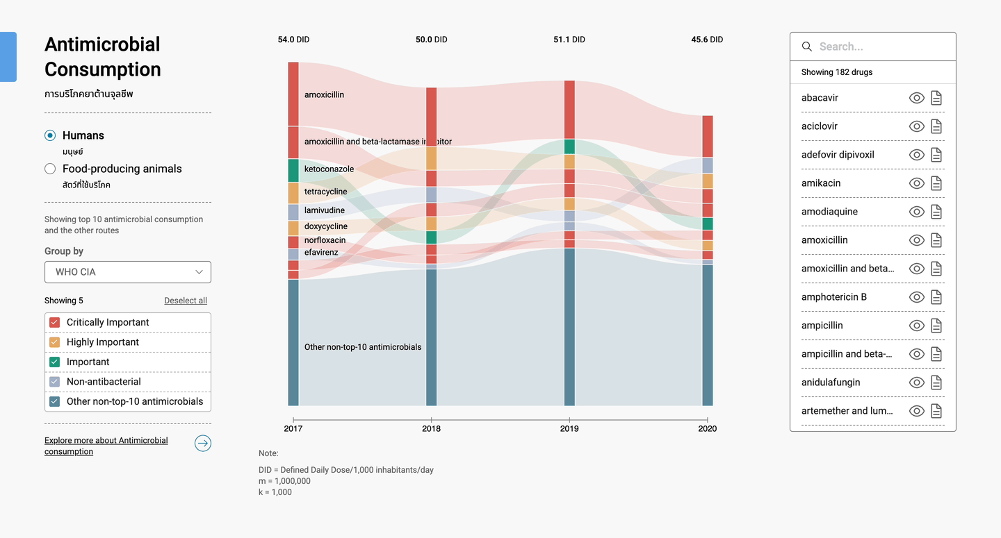
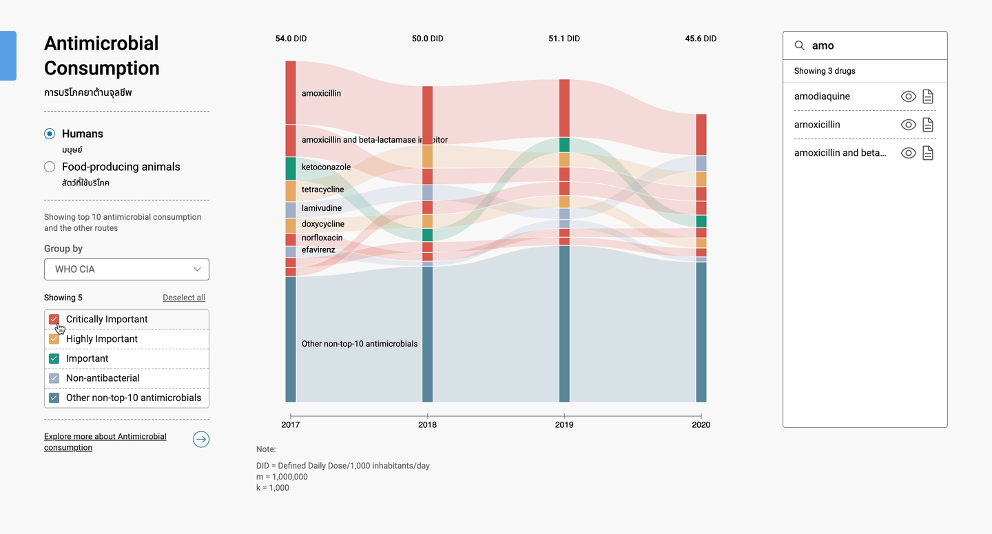
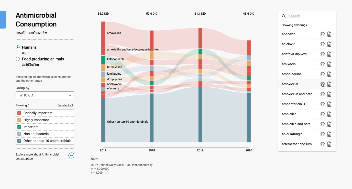
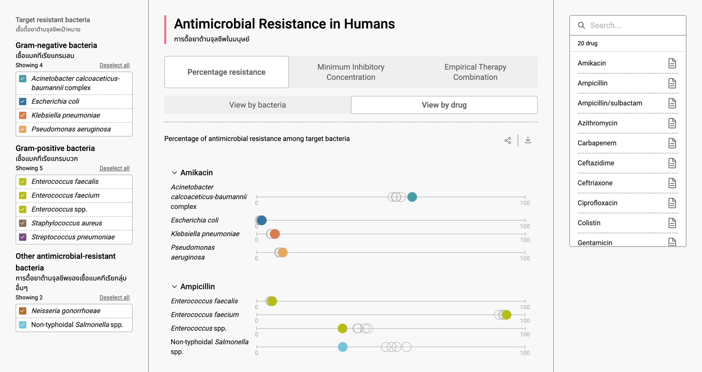
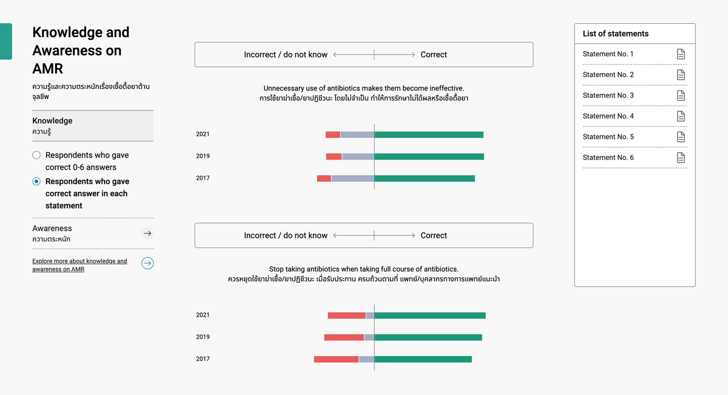
The website presents various information on the topic of antimicrobials including Antimicrobial consumption, Antimicrobial resistance Awareness and knowledge on antimicrobials therefore, we tailored different types of charts to best introduce each piece of information. The prospective users include researchers, scientists, policy makers, and private entities who can benefit from data analysis and trend forecasting.
The website presents various information on the topic of antimicrobials including Antimicrobial consumption, Antimicrobial resistance Awareness and knowledge on antimicrobials therefore, we tailored different types of charts to best introduce each piece of information. The prospective users include researchers, scientists, policy makers, and private entities who can benefit from data analysis and trend forecasting.
Challenge
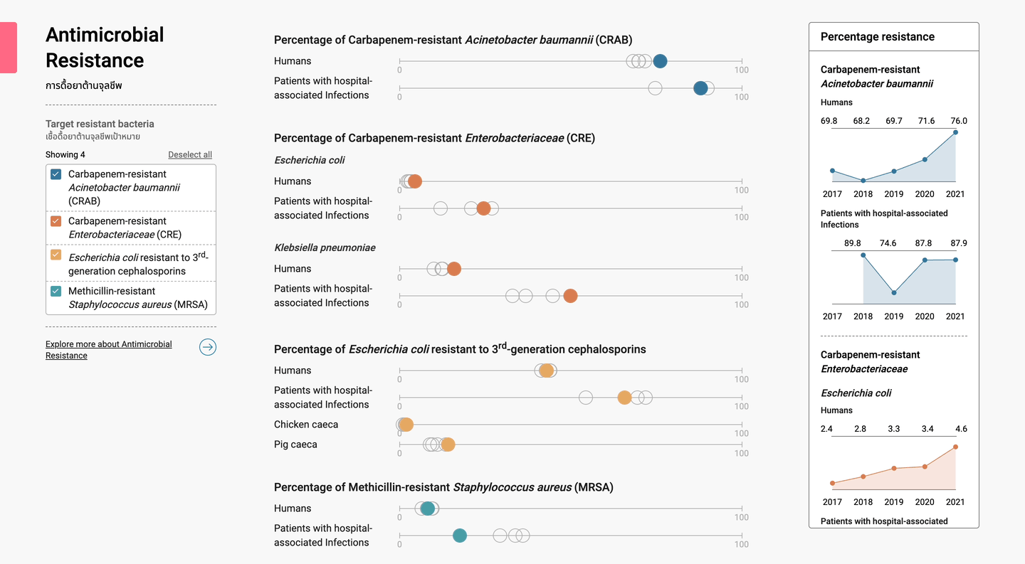
The primary challenge I faced was about organizing and analyzing the vast amount of data provided by the client to design complex data visualizations. Additionally, I needed to understand the scientific content and determine appropriate visualization techniques in order to create a strong narrative and consistency across three main topics: Antimicrobial Consumption, Bacteria Resistance Percentage, and Public Knowledge and Awareness.
my role
Lead UX/UI Designer
Designed user experiences and delivered high-fidelity prototypes.
Leveraged a variety of data visualization techniques to to transform raw data into meaningful insights. Designed dynamic charts, graphs, and heat maps combined with intuitive user interfaces that allowed users to interact with data, revealing trends and patterns that help present data insights.
Conducted A/B testing, and usability evaluations to identify areas of improvement.
Delivered presentations and design proposals, ensuring clear communication of design rationale and project progress.